Do You Have To Calibrate Your Monitor?
The short answer is “no.”
If you are using our pro lab printing services…with lab corrected color…you really don’t need a fully calibrated monitor. Our technicians do all color corrections for you when we make your prints. We use a combination of fully calibrated Eizo monitors (which are a 100% match to the print output of our photographic printers on Kodak paper) and test prints evaluated and fine-tuned by skilled technicians.
So, all you ever have to do is send us a JPEG file in an sRGB color space (a setting in Photoshop or on your dSLR camera) and we’ll do the rest. (Important: Never use Adobe RGB for submitting images to our laboratory as this will result in color errors.)
You’ll receive fully color corrected, pro-quality enlargements without ever having to do anything to your monitor. However, what you’ve seen on your monitor may not match the prints we send you. We’ll be correcting for the “real” colors seen in nature…not what you’re seeing on a backlit screen.
When Should You Calibrate Your Monitor?
If you are converting from RAW to JPEG images – A properly calibrated monitor will give you a better visual representation of your images, allowing you to better optimize their contrast and color as JPEGs.
-
If you are selecting “Studio Corrected Color” – Studio corrected color services, where you do the color corrections and are responsible for your own color, offers an economical way to save money through lower per print prices (by saving us the labor to correct your color). This can be advantageous on proofs, where you don’t need your color to necessarily be “perfect.”
But, since you are 100% responsible for the color you receive on your prints it is essential that you be properly calibrated if you expect to get color approximating what you’ve seen on your monitor.
-
When you prefer making your own color corrections – Some photographers want to do their own color corrections. We’re happy to oblige if they simply put “Do not correct color” in the Instructions… section of our Order Review page. However, for this to work the files the photographer is sending us must match our output on Kodak Endura color papers. It’s essential that the photographer’s monitor is a 100% match to our output as we are not responsible for color errors where the photographer does the corrections and asks us not to apply any further corrections.
-
When you are making your own inkjet prints – A consistently calibrated monitor gives you the first step in color management from what you see on your screen to the print you actually get.
Three Approaches to Calibrating Your Monitor
-
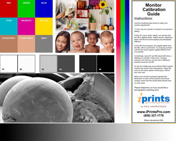
Basic - Use the Color, Brightness and Contrast Controls on Your Monitor to Adjust & Calibrate Your Screen Using Our Downloadable, Free Monitor Calibration Chart as a Guide
-
Advantage - This is a “free” visual method that requires no dollar outlay on your part. Visual monitor calibration is far less accurate than a calibration device but can put you in the right “ball-park” for evaluating color.
-
Disadvantage – Though you’ll get a reasonable screen rendition of your image you won’t get a totally precise one. This is due to the fact that you won’t have a monitor output transform that would match each point of color on your screen to one being produced in a print. So, in many cases, the color you see on your monitor will not be the color you get on your prints.
-
Suggested for casual photographers who would rather not spend any money on equipment.
-
Steps to take:
-
Download our Monitor Calibration Guide. (Click here
to contact us if you would like us to send you a complimentary photographic print of the color chart to use for on-screen matching purposes.)
-
Set your monitor to:
Gamma = 2.2, White Point = 6500˚K (D65)
-
Use the contrast and brightness controls on your monitor to adjust the light intensity of the chart’s images.
-
When your adjustments have been made the color patches on the Macbeth color checking chart will have acceptable colors and the fleshtones in the portraits will look right.
-
Use Photoshop or Photoshop Elements to correct two or three of you photographic images as confirming tests. These pictures ideally would contain neutral colors and fleshtones that you have corrected to a pleasing color that is representative of how they look in real life.
Be sure that this is a color correction you will be able to repeat, as consistency is very important if you are going to be correcting your own color.
It is also extremely important that your images be JPEGs corrected in an sRGB color space (never Adobe RGB). If you have had your images in Adobe RGB be sure to convert to sRGB in Photoshop before correcting and submitting them to our laboratory.
-
Submit your corrected images to our laboratory in a ROES order. Under “Instructions” indicate that these are calibration test images. We will do up to 6 8” x 10” test images at no charge to you. You will have to indicate payment to complete the order. However, your credit card will only be charged for postage.
-
When you receive your test prints from our laboratory compare the prints to your screen image and re-evaluate your corrections.
-
If the prints are dark, for example, be sure that you didn’t bias your original correction that way. This is important because you want to be able to comfortably correct color to your taste but still get acceptable color. Consistency in how you correct is essential.
-
Assuming your original corrections were as you wanted them, use your monitor’s brightness and color controls to match the color of your screen image to the prints when viewed in “normal” room lighting or by daylight. This will provide you with an operational offset (hopefully a small one from our test chart) so that future corrections of other images will match our print output.
-
Consider A Confirming Test – If you want to check that your calibration is accurate, correct another set of 2 or 3 different images and submit a second ROES order…again taking advantage of our complimentary offer. Check these prints, when they are returned to you, to make sure your offset is correct. Feel free to contact our customer service department if you have any questions.
-
10. Our 6 Print Test Offer is also good if you choose to use either of the next two calibration and color management approaches.
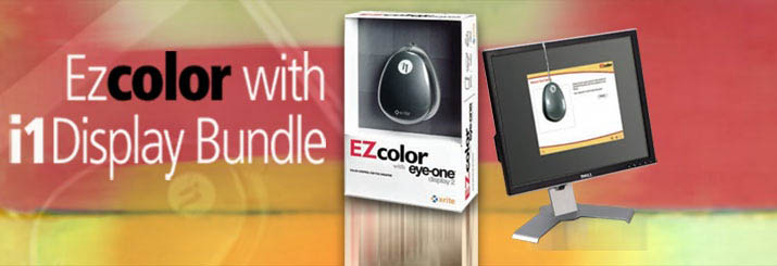
2. Better - Use a Professional Monitor Calibration Device
-
The most precise method of getting proper color and gamma calibration
-
Suggested for professionals and advanced amateurs
-
Provides both a color calibration, where your monitor is corrected to a neutral grey, and a custom monitor output profile for more precise color rendering of colors you see on your monitor to the ones you’ll get on your prints.
-
Totally repeatable, allowing you to recalibrate each month to compensate for changes in your monitor
-
Involves a moderate dollar investment but is well worth the money if you want to save money on waste and consistently get a good match to lab color
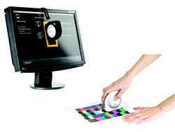
We suggest using the same calibration system we use in our laboratory; X-Rite’s Eye-One Display 2 System.
-
The Eye-One measures your monitor screen and automatically adjusts you monitor with custom firmware drivers. Then, it creates an exact output profile for your monitor that will work with photographic printing machines for more precise color rendition. The system includes control software that scientifically balances your monitor and provides you with the closest calibration your monitor is capable of producing.*
-
The Eye-One system produces consistent neutrals and may be used on several different monitors.
-
Settings we’d recommend to match our laboratory monitors:
Monitor setting:
Intensity setting in the Eye-One Input Info box = 100 cd2, Gamma = 2.2, White Point = 6500˚K (D65)
-
To Purchase an Eye-One: Please visit our online store at www.dalephotoanddigital.com or go directly to the Eye-One information page at http://www.dalephotoanddigital.com/_e/Monitor_Calibrators/product/7640111921103/X_Rite_Eye_One_Display_2.htm. Price: $249 plus shipping.
-
The ColorMunki by Eizo is a more expensive, spectrophotometer based system, that can be used by photographers who want to use both our laboratory prints and ones they make themselves on ink jet printers.
To Purchase an ColorMunki system : Please visit our online store at www.dalephotoanddigital.com or go directly to the ColorMunki information page at
Price: $495 plus shipping.
* Many consumer-grade monitors are designed to produce bright, vivid colors. Because they are biased toward brighter colors they may not have the range to be darkened enough to totally match the intensity level required to produce an accurate white on silver halide photographic paper. See a full explanation in the Eizo monitor section below.
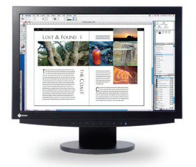
3. Best - Use a 100% Matched Monitor and Calibration System -
-
Here’s our suggestion for professional studios and dedicated, advanced amateurs. If your current monitor can’t be fully calibrated you should consider purchasing a professional level monitor to replace it.
-
We recommend Eizo monitors used in combination with an Eye-One or ColorMunki monitor calibration system. This will allow you to get a complete match to our printing systems. It will also help to give you a pro-level solution to getting first-run prints on your inkjet printer.
Why Not Use Photoshop’s Soft Proofing Feature?
Many of our customers have requested a Photoshop profile so that they can plug in a “magic number” and automatically see on their screen what we will output on our prints. This is a great idea in theory but tends not to work well in practice.
The reason is that the flattened images you get in Photoshop need to transition through several different photographic printing systems in our laboratory to print your enlargements. Each of these printing systems utilizes color lasers to print on Kodak silver halide photo paper. Your prints are rendered through a sophisticated Kodak output software (Kodak Pro Lab DP2), which modifies the color from digital numbers to a laser energy output. This requires considerable balancing within our lab to have a given input produce the same output on all of our printers. The problem is that no single profile from Photoshop will accurately reproduce colors on all of our printers. (The same is true for all pro labs.)
So the bottom line is that the accuracy of the soft proof in Photoshop will often be very “soft” and not at all accurate to what is being printed on Kodak photographic paper. (While it is generally OK for inkjet where you can test and retest until you get the color right.)
That’s the reason we’re suggesting you complete the color management loop by matching your monitor’s “numbers” to ours with a scientifically calibrated calibration system such as the Eye-One or by adjusting your monitor with our chart and visual correction to match your screen images with real photographic prints output in our laboratory.
|